Harvest - Treehouse's DeFi Analytics

My Role
UX Designer (+ a dose of QA)
Project Timeframe
~ 4 months
Tools Used
Figma, Miro
My Impact
Led the UI/UX design for features assigned to me. Successfully handed over the features and worked with developers through deployment to resolve any issues if there are any.
Feature 1: Add to Watchlist.
"Allow users to seamlessly add desired positions to their watchlists so that users can easily monitor and track positions they are interested in or are already investing in"
Prior to this, there wasn't a feature available to allow users to monitor cryptos they are interested in or have already made purchases for. Through a round of competitive analysis, it was found that this put Harvest at a disadvantage as many other crypto platforms such as Cryptowatch and CoinGecko allow users to do so. Thus, the primary objective was to provide users with a smooth mechanism for adding positions of interest to their designated watchlist(s). This functionality extends to enabling users to effortlessly create, modify, and remove items from their watchlist(s), with as much flexibility as possible.
Market research to identify best practices
Market research was performed to identify best practices that can be learnt from other platforms offering similar features. This included relevant platforms such as CoinGecko and other platforms such as Airbnb where users are able to add home listings to their bookmarks.


Creation of user flow before prototyping
Prior to initiating the prototyping phase, user flows were charted out. The creation of user flows allowed me to envision how the entire feature would work, and chart out the most optimal and streamlined user journeys, backed up by market research. This is particularly important as the feature has an impact on pre-existing features on Harvest, so all entry points have to be identified and taken into account. Additionally, it helps in accounting for edge cases.


High fidelity prototype was created after brainstorming on the best user flow/journey
The final result is a streamlined and user-friendly watchlist page. Users can effortlessly generate new watchlists, make edits, delete watchlists, and append new positions to their existing watchlists. Given the maximum allowance of 3 watchlists per user, I opted for a tab-based design that enables users to seamlessly switch between their watchlists. This design choice eliminates the need for an additional step (if other methods such as dropdown menu was utilised).


Feature 2: Tagging of Transactions.
The goal is to allow users to easily add tags and notes to each transaction so that they will remember what a transaction is about in the future
Addressing a prominent user concern, this feature targets the issue of users frequently struggling to recall the context of recorded transactions on the platform. Its objective is to empower users to tag transactions and attach notes to each one. This way, when users review their transaction history, they will receive timely reminders regarding the specifics of each transaction.
High fidelity prototype was created after studying how other sites such as Notion does its tagging and note adding feature
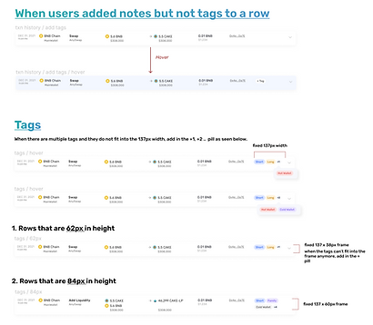
A central challenge concerning this feature revolves around devising an elegant strategy for integrating the "Add Tags" and "Add Notes" buttons within each row. The aim is to strike a balance where the design remains unobtrusive and non-repetitive, yet still conveys a clear understanding to users regarding the feature's functionality.
To address this, a solution was devised where the tags and notes buttons were exclusively incorporated into the initial row of the transaction page. Subsequent rows, on the other hand, reveal these buttons solely upon user hover. This approach guarantees users' awareness of the feature while eliminating any sense of repetitiveness, as the buttons elegantly reveal themselves upon interaction.


Users are able to easily make edits or delete created tags by simply clicking on the respective icons that appear, as seen below.


Upon hovering over a row with tags but without notes, the "Add Notes" button will appear, where users can click and seamlessly append their desired notes, as seen below.


In instances where a transaction is accompanied by attached notes, a dropdown arrow will be added to the row. A simple click on this arrow will unveil the accompanying notes. Meanwhile, hovering over the notes triggers the appearance of an edit button, allowing users the convenience of making required edits or deletions.


An additional hurdle for this specific feature involved formulating an approach to exhibit an extensive array of tags within the limited space. To address this, I introduced a solution where, if the exhibited tags surpass the designated width of 137px (a determination reached after deliberation with developers), a "+1," "+2," etc. button emerges, signalling to users that additional tags are present but not fully visible. On hovering over these tags, a dropdown appears, unveiling the concealed tags.

Defining tag behaviour
Before handing over the designs to developers, the behaviour of tags was clearly outlined. Things such as what are the default tags, how users can rearrange tags, and what happens when a user adds a note but not a tag (and vice versa) have to be communicated clearly to the developers.

Other UI designs worked on
Revamping of Harvest UI and Widgets

Backend Account Management Portal


Email Templates


Wait... What about usability testing?
As Treehouse faced limited resources, there wasn't any time or resources allocated for usability testing. Thus, what I did was to approach my fellow colleagues in the office and friends who I know are into crypto, to test out the new features for me. While this is not the most desirable scenario, I managed to obtain some useful feedback to improve the user experience.
It taught me a valuable lesson that in the real world we may not have the time or resources to conduct research/testing best practices. Thus, it is always important to find workaround solutions.
💭 Reflection & Key Takeaways.
Throughout my journey, I've acquired profound insights that improved me as a UIUX designer.
👥 Domain Knowledge
Before my tenure at Treehouse, my understanding of DeFi and Web3 was virtually non-existent. This presented a significant challenge as I grappled to comprehend the intricacies of features, metrics, and terminology in use. This realization underscored the fact that crafting optimal user experiences necessitates not only a foundation in UI/UX principles but also a technical grasp of the industry in which I operate. As a result, I dedicated additional effort to immerse myself in the Web3 sector, ensuring my ability to devise features that effectively address user pain points within the DeFi realm.
🎨 Design System and Atomic Prototyping
Before joining Treehouse, my exposure to working with a high number of UI/UX designers was limited, simplifying collaboration. However, during my tenure here, I gained a profound appreciation for the value of a comprehensive design system. This system serves as a critical tool in maintaining design consistency across diverse designers. Moreover, I acquired proficiency in atomic prototyping—a technique that significantly expedited the process of implementing alterations and refinements to designs, saving valuable time in the development cycle.